Top 5 Web Design Trends Transforming User Experience in 2023
As we dive deeper into 2023, web design trends continue to evolve, shaping the way users interact with websites. From immersive multimedia elements to enhanced accessibility features, designers are prioritizing user experience like never before. One of the defining trends this year is the rise of minimalist design, which focuses on simplicity and functionality, allowing users to engage with content without distraction. This trend not only enhances visual appeal but also improves site speed and mobile responsiveness, crucial factors in retaining user attention.
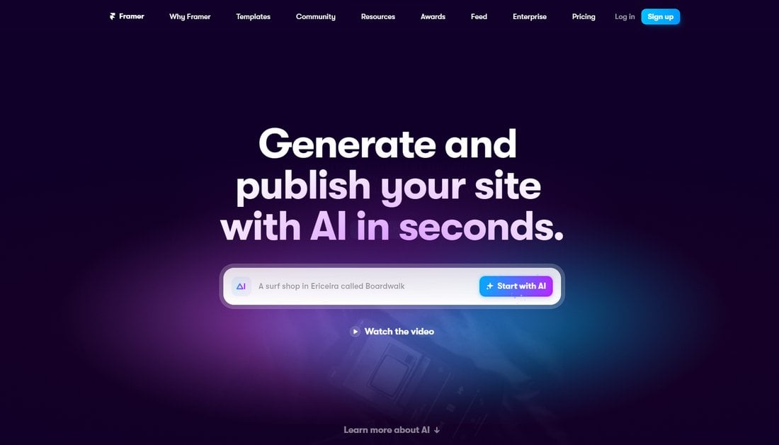
Another significant trend transforming user experience is the integration of dark mode options across websites. Dark mode not only reduces eye strain, especially in low-light environments, but also provides a modern aesthetic that many users have come to prefer. Furthermore, the use of 3D elements and animations is on the rise, adding depth and interactivity while creating a more immersive browsing experience. Together, these trends illustrate a shift towards a more user-centered design approach, emphasizing not just functionality but also emotional engagement and aesthetic pleasure.
How Minimalism in Web Design is Revolutionizing Online Engagement
In recent years, minimalism in web design has emerged as a transformative approach that is significantly enhancing online engagement. By stripping away unnecessary elements and focusing on essential features, designers are able to create more user-friendly interfaces. This design philosophy not only helps to reduce cognitive overload but also guides users toward the primary actions a website intends to promote. For instance, using ample white space can direct attention to key information, while a streamlined navigation system makes it easier for visitors to find what they need quickly.
The benefits of minimalism in web design extend beyond aesthetics. Websites that embrace simplicity often experience faster load times, which is crucial for maintaining user engagement. According to studies, users are less likely to abandon a site if it loads quickly and provides a clear path to desired content. Furthermore, minimalistic designs adapt more readily to various devices, ensuring a seamless experience across desktops, tablets, and smartphones. As digital landscapes evolve, it's evident that embracing minimalism not only enhances visual appeal but also fosters deeper connections with users, effectively revolutionizing online engagement.
What Are the Key Features of Responsive Design in Today's Digital Landscape?
In today's digital landscape, responsive design has become a cornerstone of web development, ensuring that websites perform seamlessly across a variety of devices. One of the key features of responsive design is its fluid grid layout, which allows elements to resize and rearrange dynamically based on the viewport size. This eliminates the need for separate mobile versions of websites, streamlining maintenance and updates. Additionally, the use of media queries enables designers to apply different styles depending on the characteristics of the device, such as its width and resolution, providing an optimal viewing experience for users.
Another essential element of responsive design is the incorporation of flexible images and media. By using CSS techniques that scale images proportionally, designers can ensure that media elements do not disrupt the layout on smaller screens. Furthermore, responsive typography adjusts text sizes and line-spacing based on the device, enhancing readability and user engagement. Overall, these features not only improve user experience but also contribute to better SEO, as search engines increasingly favor mobile-friendly sites in their ranking algorithms.